Fizy sets the stage:
Building a design system for the future of music streaming.
A design case for optimizing Fizy’s web player with a new design system.

Disclaimer
In compliance with the non-disclosure agreement I signed, I have omitted sensitive data and obfuscated figures. All information in this case study is my own and does not reflect the views of my clients.
Fizy, a leading digital music, podcast, and video service based in Turkey, serves over a million users monthly across Turkey, Germany, Belarus, and the TRNC. To adapt to evolving technology and user expectations, Fizy launched a redesign of its mobile app to enhance engagement and strengthen its market position. Known for its extensive content library and personalized experiences, Fizy offers unique listening and viewing experiences through various platforms, including mobile apps and web players.
Year :
2019 ・2021
Duration :
6 months
Team :
product designer • 2 lead product manager • product owner • frontend developer
My role
Project leadership
Guided the analysis and design process, establishing project plans and timelines.
Design system creation
Developed a comprehensive design system guide, ensuring consistency across the product.
Cross-functional collaboration
Worked closely with business and software teams to align goals and implementations.
Problem statement
The web player suffered from neglect, resulting in accumulated deficiencies and design inconsistencies. Our objective was clear: revitalize the web player to ensure a seamless, consistent user experience across all platforms. The challenges were multi-fold:
Design inconsistencies
The absence of a unified design language led to a fragmented user experience.
Screen dimensions issue
A lack of standardized screen sizes complicated the frontend development, requiring frequent redesigns.
Platform alignment
The need to align the web player's design more closely with the mobile app to maintain coherence across device
Design process
01.
Discovery phase
・Identifying challenges
・Product analysis
・Ensuring consistency and standards
・Acknowledging platform-specific design
02.
Definition Phase
・Information architecture
・Building documentation
・Specification of design elements
・Determination of size and layout parameters
03.
Design phase
・Development of design system
・Creation of core components
・Execution of redesign strategy
04.
Delivery
・Prototyping
・Design system hand over
Product Analysis
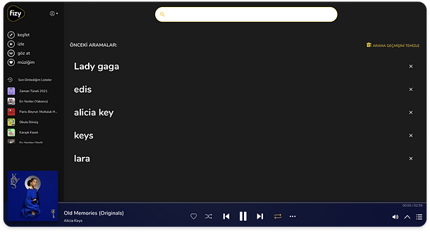
To understand how the product functions, how users navigate to listen to music, watch videos, or download music, and to grasp the product’s functions and design components, it was essential to conduct a detailed product analysis. I initiated this by creating a comprehensive audit, starting with capturing screenshots of all screens to establish a "source of the truth" screen flow.
Creating screen flow for component inventory

Ensuring consistency and standards
During the analysis, I observed that many design elements were inconsistently implemented across similar pages. This led me to begin designing a design system by creating a component inventory.
Player screens


Defining inconsistent components
I gathered all similar design elements, such as button designs, to establish a single, definitive design model. This process was repeated for all components.

Establishing Information architecture
I developed the information architecture to ensure that the entire team could visualize the basic structure of the product and facilitate further development on it.

Building documentation
Before commencing the design phase, it was crucial to establish fundamental design standards. I set up naming conventions and then created a list of screens. This system enabled us to track which screens were being worked on during the design and development processes and to monitor the completion of specific workflows.
File Naming ;
Naming format : ProductName_PlatformType_ScreenDimension_GGAAYY.sketch
“fizy_WebPlayer_1920x1024_10112021.sketch”

Page Naming ;
Page naming will be as follows.
--- Flows ( e.g. : Homepage, Detail Page, Players, Payments etc..)
--- Features ( e.g. : Like/Dislike etc..)

Component Naming ;
While naming, the system breakdown and state of the element are taken into account.
Textbutton/primary/size/state
Design system model
The importance of a thorough content inventory was paramount for this project. I examined various design systems and established a content tree through benchmarking. After completing the primary content tree, I organized my design components under specific headings, utilizing the Web Player screen flow and Mobile design guide to finalize this structuring.
Design system benchmarking


Atlassian
Anvil Design Sytem
Momentum
Evergreeen
Material Design
Gitlab
Redesign the screens
Clarifying many elements during the research process made my creation process much more comfortable. Having finalized foundations and main components such as color typography while preparing the mobile guide made our work more straightforward in this process.
I adapted the design language from the mobile app for the Web Player redesign.
Previous design

Redesign

Building the design system


Typography
Colors
.png)
Icons
.png)
.png)
Radius
Actions
.png)
.png)
.png)
Frameworks
Cards
Others
Typography
Previously, the usage of typography lacked clear guidelines, with two different fonts in the mobile app and three in the web player, none of which were used efficiently. We unified this by adopting a single, more effective font across platforms, enhancing clarity and consistency.
Icons
Building the design system revealed the inefficiency of icon selection. To streamline the process, detailed icon information was integrated into the icon guide, significantly reducing search time and enhancing design efficiency.

Radius
Confusion arose from inconsistent use of radiuses in the design, affecting both product understanding and software development. A dedicated document now clearly defines the radiuses used, resolving previous ambiguities.
Actions
A variety of buttons were identified during the initial research. These have been standardized in line with the mobile app's design, with each button's state now clearly documented in the design system, ensuring consistency.

Cards
Our product extensively uses card designs, necessitating a comprehensive inclusion of all card types and their states in the design system. This approach facilitates easy updates and additions as needed.

Frameworks
Framework elements designed in fizy were almost non-existent. Concerning that, working on this area in more detail compared to other volumes was good.

Other elements
In addition to the detailed components, the design system now encompasses layouts, visuals, illustrations, navigation aids, players, data tables, modals, and content elements, creating a holistic guide for future design consistency and efficiency.

Outcomes
Previous

Redesign

Previous
.png)
Redesign
.png)
Previous
.png)
Redesign
.png)
Conclusion
Implementing a design system over the past six months has markedly enhanced the design coherence and usability of our web player. This structured approach has revolutionized our team's workflow, significantly increasing efficiency and reducing time spent on design tasks. By standardizing design elements, our team has been able to reduce redundancy, streamline communication, and accelerate the development process, ultimately leading to faster project turnaround times.
Looking ahead, the next phase of our project will focus on expanding the design system further and establishing a comprehensive set of best practices. This documentation will serve as an invaluable resource for onboarding new team members and maintaining consistency across our projects, ensuring continued efficiency and quality in our design efforts.