fizy,
Unlock the bright, happy, and colorful universe of music.
A design case for redesigning music streaming product.

Disclaimer
In compliance with the non-disclosure agreement I signed, I have omitted sensitive data and obfuscated figures. All information in this case study is my own and does not reflect the views of my clients.
Fizy, a leading digital music, podcast, and video service based in Turkey, serves over a million users monthly across Turkey, Germany, Belarus, and the TRNC. To adapt to evolving technology and user expectations, Fizy launched a redesign of its mobile app to enhance engagement and strengthen its market position. Known for its extensive content library and personalized experiences, Fizy offers unique listening and viewing experiences through various platforms, including mobile apps and web players.
Year :
2021 • 2022
Team :
2 product designer • design manager • product owner • lead product manager • 2 technical product manager • engineering team
My role
• Worked closely with product managers to define the product vision, strategy, and roadmap.
• Conducted a thorough review of the existing design to identify strengths, weaknesses, and areas for improvement and redesigned three product.
• Worked closely with developers to ensure accurate implementation of the redesign, addressing any technical constraints or challenges that arise.
• Developed comprehensive design systems to ensure consistency and optimized the design effort of the teams.
Problem statement
Modernizing the interface
Prior to the redesign, the mobile app suffered from an outdated interface with numerous legacy design files and flows that did not meet current user expectations or technological standards.
Inefficient user experience
Users faced challenges with discoverability and navigation within the app, which hindered their ability to find and enjoy content effortlessly.
Lack of personalization
The app lacked sufficient personalization features, which are essential for enhancing user engagement and satisfaction in a competitive digital streaming market.
Inconsistent design language
There was a lack of a unified design system, resulting in inconsistent user interfaces across different platforms and features within the app.
Understanding our users:
insights and inspirations
Our journey began with a deep dive into understanding who we're designing for. Fizy, an app cherished by its users as a family member, needed to evolve without losing its essence. Our research highlighted a universal desire for more diverse music options and a more intuitive interface, alongside generational divides on the balance between novelty and nostalgia.
User Personas and Needs
We developed detailed personas to guide our design strategy:

Selin Su
University student
It belongs to the group with the highest expectations from Fizy. She would like to discover new music with fizy. The product's technical features are essential for her (sound quality, list creation, music variety, usability...) She uses different applications to find better music.
.png)
Kerem Ali
High school student
He is open to discovering new things and he uses multiple apps to find the best music. He is responsible for accessing popular music and his friends' comments are important to him. The lyric feature is one of fizy's favorite features.
.png)
Merve Naz
Housewife
Since he is too busy, he prefers to use products that provide high usability and uninterrupted music service while listening to music. He is meticulous with his applications and gives importance to technical features.
.png)
Ahmet Efe
White collar
Since he spends most of his time busy, he prefers to use products that provide high usability and uninterrupted music service when he wants to listen to music. It is meticulous about its applications and gives importance to technical features.
Design approach
Our market research indicated a growing demand for personalized experiences and intuitive interfaces. User feedback highlighted the need for:
Clean & clear design
To achieve a more intuitive and hierarchically balanced design.
Enhanced discoverability
To allow users to easily find new music, moods, and genres.
Improved legibility
To ensure users can effortlessly locate their desired content.
Personalized experience
To make users feel uniquely understood and valued.
Defining design standarts
Upon taking over from a previous design agency, we encountered numerous outdated design files. Our initial task was organizing and auditing these resources. We established clear communication protocols and set foundational team guidelines to ensure consistency and efficiency.
Documentation and project tracking
Implemented using Trello for real-time updates and accountability.
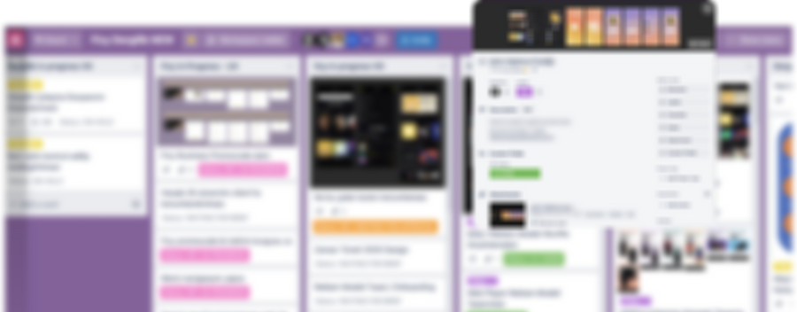
Creating screen flow for component inventory

Defining the design system
The foundation of our redesign was the development of a comprehensive design system. This system included a unified set of design elements such as color palettes, typography, icons, and spacing guidelines, all intended to create a cohesive look and feel across the app.


Discovery
To improve product discovery and navigation, we introduced a modular design to the homepage that enriched the content and layout. Users' emotions play a crucial role in music selection, so we categorized music into genres and situations to help users navigate with ease and find music that matches their mood or context.
Previous

Redesign


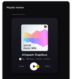
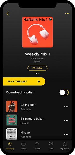
Playlists
During the redesign process of the playlist flow, we focused on both the visual design and functionality. Our objective was to meet users' new functional needs by addressing this area from end to end. To achieve this, we highlighted fizy social features such as the ability to follow artists and lists and offered users opportunities to explore new possibilities with the shuffle listening feature. We also enabled users to seamlessly view music by featuring the offline listening function without interruption.
Previous
Redesign

Playlist pages


My music
"My Music" is a key area where users access playlists, favorite artists, and recent songs. To enhance user engagement, we introduced our Podcast feature, requiring structural and design updates for clearer navigation. We optimized space by adjusting the visual hierarchy and navigation layout, improving content visibility and streamlining user interaction. This allows users to efficiently explore their music and podcasts, ensuring a cohesive and enjoyable experience.
Previous

Redesign

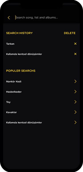
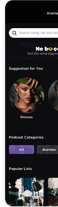
Search
As we continually strive to improve our product, users voiced a significant demand for a more efficient search function. Specifically, they wanted to be able to see suggestions more readily and to search by lyrics. Responding to this feedback, we decided to revamp the search function to offer lyric search and more effective suggestions. Our goal was to enhance the user's experience and make it easier for them to find the music they love. The new search field allows for a more seamless search experience, catering to the diverse needs of our user base.
Previous
Redesign

Search feature


Outcomes
The redesign of the Fizy mobile app has led to a marked improvement in user engagement and satisfaction. By focusing on user-centered design, we have created a more intuitive and enjoyable experience that resonates with our diverse user base. Our efforts in personalization and usability have positioned Fizy as a more innovative and user-friendly platform in the competitive music streaming market.
4.6
stars on the
ios app store
4.04
rating on
the android store
26m
the app has been downloaded